3 Things Your Website Should Be Communicating
Updated on
Picture this: you're scrolling through the endless sea of websites, looking for that one gem that catches your eye. You know, the kind of site that makes you stop and think, "this is exactly what I needed!" That’s the magic of a website that knows how to communicate effectively – and quickly!
Let's be real, in the digital world, your website is your virtual handshake. And just like in real life, you've got about 15 seconds to make a memorable first impression. So, let's dive into the three must-haves your website should be shouting from the rooftops (or your homepage) in those crucial first moments.

01.
Who you are
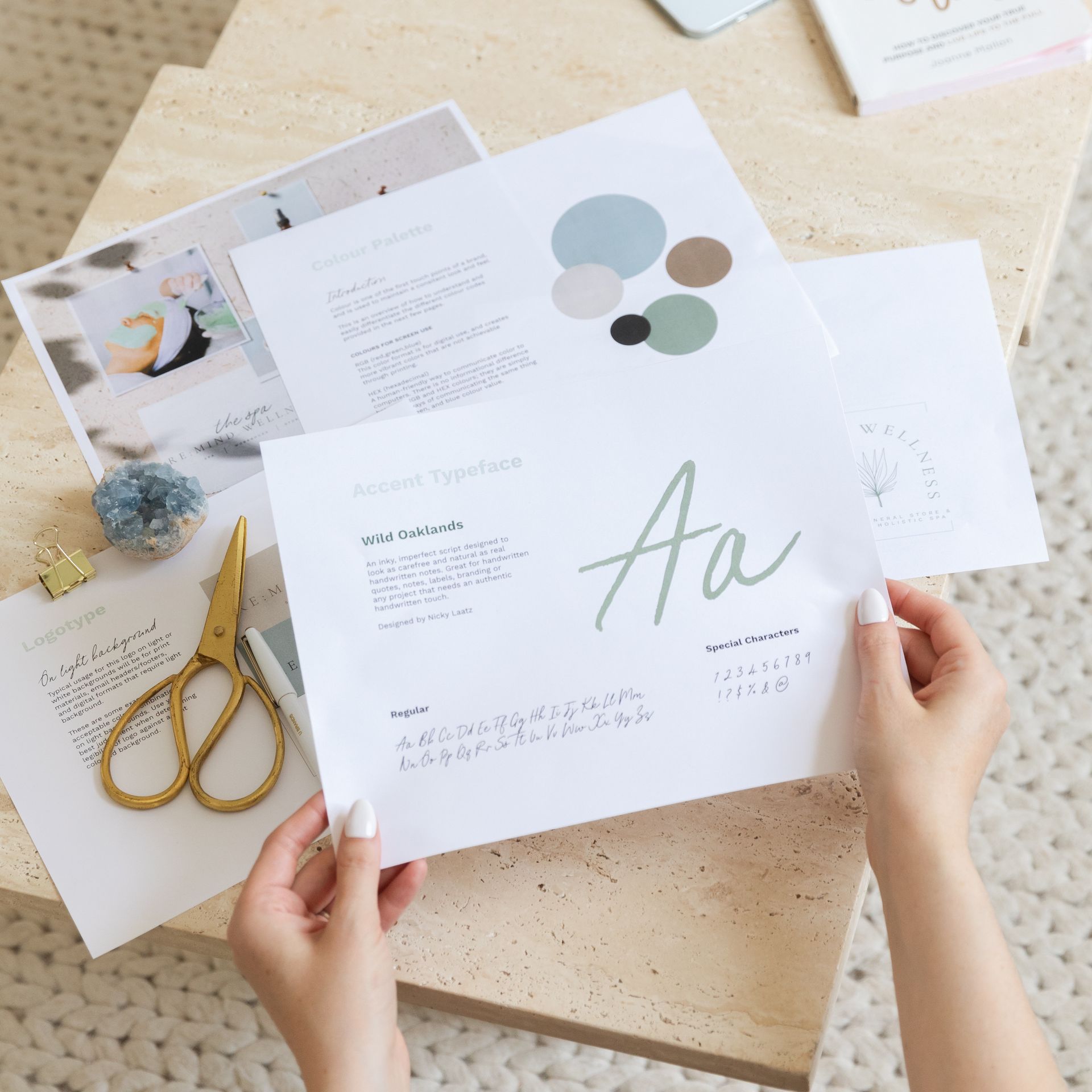
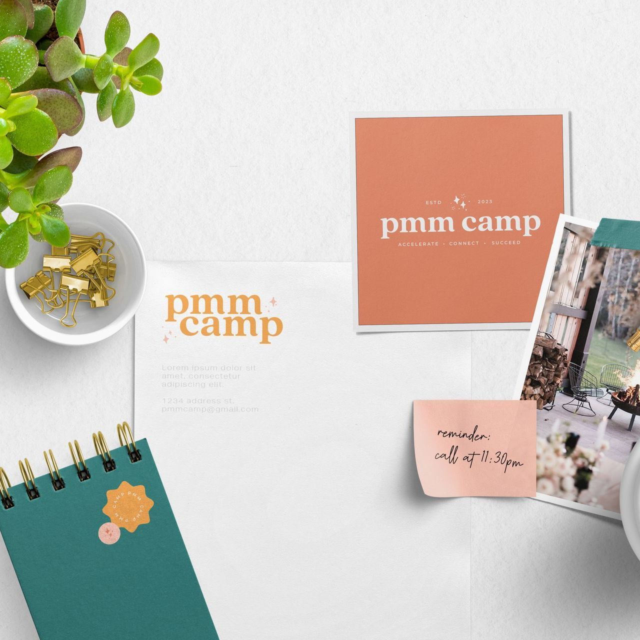
Your website should be like that friend who walks into the room and lights it up with their presence. You know, the one who's unapologetically themselves and instantly makes everyone feel at ease. That's your story – it's what sets you apart, builds trust, and adds that oh-so-important personal touch.
Think of your website as your storybook. When someone lands on your page, they should instantly get a sense of who you are. Whether it's through a captivating tagline, a warm welcome message, or photos that speak a thousand words, make sure your personality shines through. Remember, it's not just about what you do, it's about who you are.
02.
What you do
Okay, now that you've got them interested in who you are, it's time to show off what you do. And not just what you do, but how what you do is the answer to their prayers, the solution they've been searching for, the peanut butter to their jelly!
In those precious seconds, your website should clearly communicate the value of your product or service. Use snappy headlines, engaging visuals, and straightforward language to show your visitors that you've got exactly what they need. It's like saying, "Hey, I know what you're looking for, and guess what? I've got it right here!"

03.
How to take action
Alright, they're hooked. They love your vibe, and they're convinced you've got what they need. Now what? Well, now it's time to make it super easy-peasy for them to connect with you and take the next step.
Your website should have a clear and inviting call to action (CTA). Whether it's a bright "Contact Us" button, a friendly "Get Started" prompt, or an enticing "Shop Now" invitation, make sure it's impossible to miss. Think of it as extending your hand for a handshake – it's your way of saying, "I'm here, I'm ready, let's do this together!"
Feeling like your website might be missing the mark on these three crucial things? Don't worry, you're not alone! If your website needs a little TLC in these areas, it might be time for a refresh. We're here to help!
Send us an email to
hello@lumecreative.co or fill out
our contact form to get started.
Remember, in the world of websites, 15 seconds can make or break a relationship. So, let's make every second count and turn your website into a love-at-first-sight kind of experience!
Ontario Website Design
craving more?
WE LOVE THAT FOR YOU.