Should I use a JPEG as a logo file?

January 20, 2025

Have you ever wondered why JPEG {jay-peg} might not be the best choice for sharing your logo files? Let’s break it down!

A cupcake with pink frosting and sprinkles on a white background.

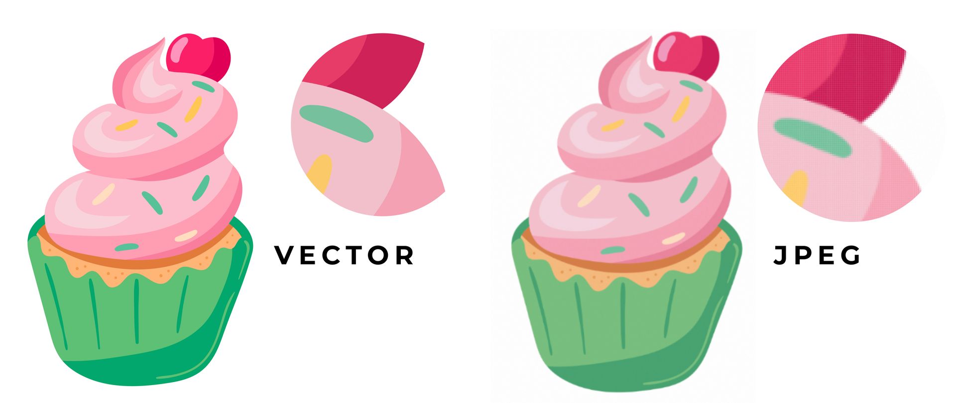
JPEGs are raster images, meaning they’re made up of countless tiny squares (or pixels) of colour that together create an entire image. They’re the most widely accepted image format and use a compression algorithm that significantly reduces the file size, making them ideal for sharing photographs and detailed images.


BUT


😬 They suffer quality issues when enlarged, leading to pixelation and loss of clarity.


☝️ Logos, which need to look sharp at any size, should ideally be saved in **vector formats** like SVG or EPS. These formats use mathematical equations rather than pixels, so they maintain their quality no matter how big or small you make them.


The Solution


To ensure your logo always looks professional and polished, always have your logo saved in vector formats. Here are some of the best options:

  • EPS (Encapsulated PostScript): Widely used in professional printing, EPS files can be opened and edited by most vector graphic software.   


  • AI (Adobe Illustrator):  The native format for Adobe Illustrator, AI files offer extensive editing capabilities and are perfect for detailed logo designs.   


  • PDF:  Although commonly associated with documents, PDFs can also store vector graphics, making them a versatile choice for sharing logos.   


  • SVG (Scalable Vector Graphics):  Ideal for web use, SVG files are lightweight and can be easily scaled without loss of quality.


By choosing the right format, you can ensure your logo always looks its best, no matter where it appears.

Topic: Branding Services Near Me

craving more?

WE LOVE THAT FOR YOU.

June 6, 2025
A beautiful website is great—but if it’s not converting visitors into actual inquiries or bookings, what’s the point? When we talk about websites that convert, we’re not talking about flashy animations or trend-chasing layouts. We’re talking about sites that guide your audience seamlessly toward action. Ones that don’t just look good—but work hard.
A person wearing jeans and white sneakers is flying through the air.
June 1, 2025
We launched Website-in-a-Week to serve fast-moving, budget-conscious clients. Here’s why we decided to pause it—and what it taught us about staying in our lane (on purpose).
A woman wearing sunglasses is laying on a tennis court
May 28, 2025
Because your DIY logo isn’t cutting it. See an example of how semi-custom brand kits help small businesses look polished, professional, and totally on-brand—without the higher custom price tag.
A woman is holding a stack of books and a laptop that displays a custom website redesign
By Lume Creative May 16, 2025
As we hit year four of Lume, we realized our old site just wasn’t doing us justice anymore. Our services had evolved, our portfolio had grown, and our brand voice had really found its stride. But our website? It still looked like day one. So we hit refresh. Hard. In this blog, we’re giving you a behind-the-scenes look at why it was time for a change, how we approached our redesign, and what the new Lume site says about who we are now.
Two women are standing next to each other holding up signs.
By Kerri Tomljenovic April 11, 2025
If your website copy feels flat, it might be your brand voice. Here's how to inject clarity, confidence, and personality into your words.
Lume creative at a desk building a brand for a small business
March 28, 2025
Build a brand that looks as legit as your business. We create strategic, personality-packed branding for service providers who are ready to grow and stand out.
More Posts