Bad Bunny Super Bowl Colour Analysis
Filed under:
Bad Bunny Super Bowl Colour Analysis
Watching Bad Bunny’s Super Bowl halftime show through a designer’s eye reveals how intentional visual choices can guide attention, create hierarchy, and tell a story at a massive scale. While millions experienced it as entertainment, designers can appreciate the planning, colour strategy, and composition that made every moment feel cohesive.
Appreciating the Production and Visual Flow
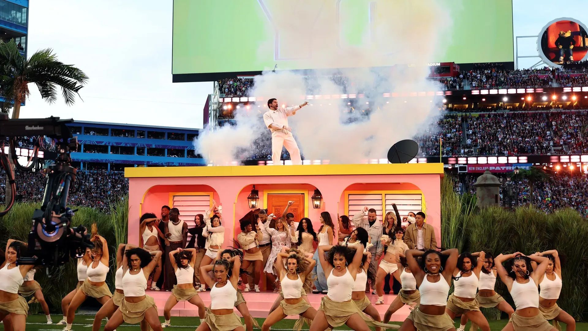
From the opening in a field of sugarcane to the carefully placed props like domino tables, street vendor carts, and a pink casita, the performance was a masterclass in visual rhythm. Each element served a purpose, creating focal points and guiding viewers through the stage in a way that felt effortless but required incredible coordination. For digital designers, this is familiar territory. Just like a well-designed website, every component is intentional, creating flow, hierarchy, and a seamless user experience.
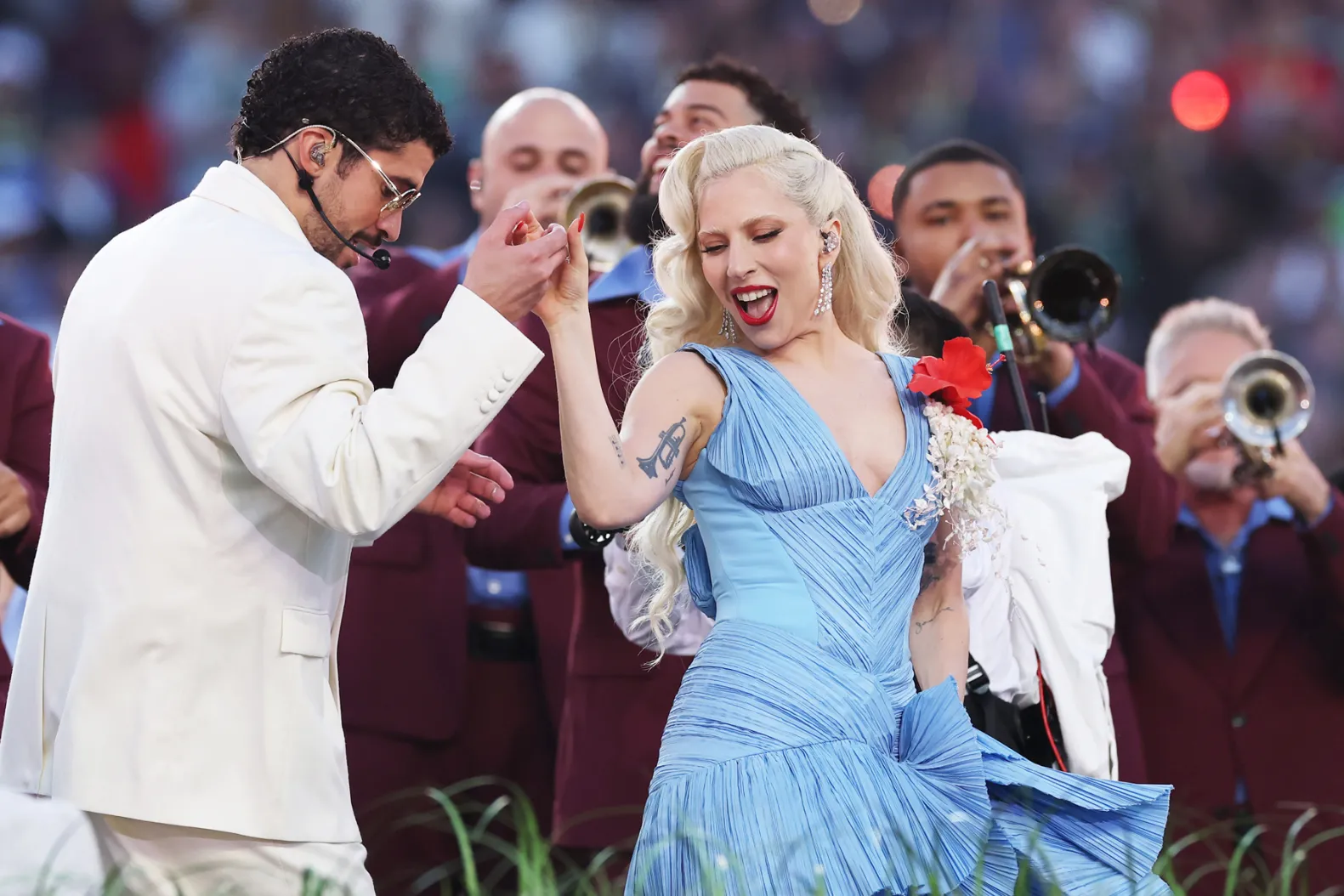
Wardrobe and colour choices were equally deliberate. Bad Bunny wore white to provide contrast and allow other visual elements to stand out, while Lady Gaga’s flowing light blue dress mirrored accents in the stage design. The light blue also echoed the Puerto Rican flag, tying performers, props, and visuals together. This demonstrates how thoughtful colour repetition can create a visual throughline, similar to consistent branding across a website.
Colour, Visual Language, and Web Design Lessons
The show’s palette blended warm yellows, soft pinks, and rich burgundy with light blue accents. For a digital designer, each choice is a lesson in hierarchy, contrast, and audience perception.
Soft yellows and pinks create warmth and approachability. In web design, similar tones can guide users, establish mood, and encourage engagement. Burgundy adds depth and anchors the palette, providing contrast that draws the eye to key elements. Light blue appears both in Lady Gaga’s dress and the flag, creating a visual thread that links different sections and moments of the performance. This is directly applicable to digital interfaces, where consistent colour cues help users navigate a site without confusion.
Educational Takeaways for Designers
Colour is never just decoration. Each shade communicates hierarchy, draws attention, and influences perception. Repetition and contrast establish flow and visual clarity. Strategic colour choices, combined with placement of key elements, ensure that every part of a composition supports the story you are trying to tell.
For example, using a recurring accent colour like light blue in multiple areas of a digital interface or branding can create cohesion and make the design feel intentional rather than random. Deeper tones can anchor sections, guide attention, and prevent the overall experience from feeling flat. These principles are the same ones used on stage, applied in web and digital design contexts.
What This Means for Your Brand
Just like the performance, your brand deserves intentional design that guides your audience and tells a story without words. Colour, spacing, hierarchy, and consistency all work together to build trust and clarity. When visuals are thoughtfully aligned, users engage more easily and perceive your brand as professional and cohesive.
Curious how your brand could look with clarity and intention? Explore our work. Then let’s make yours happen.
Published :
Craving more?
WE LOVE THAT.