How Personality, Colour, and Design Shape a Brand
Filed under:
Personal Branding
Branding is not just a logo.
It is not just colours or fonts either.
Branding is personality made visible. It’s the feeling people get when they interact with your business. It’s how your website looks, how your copy sounds, and how your visuals connect emotionally with your audience.
To show how personal branding actually works, we looked at something close to home and asked a simple question: what would Jill, Kerri, and Alicia look like if they were brands? Same studio, same design skills, but completely different identities, personalities, and visual styles. And that is exactly the point.
What Personal Branding Really Means in Design
Personal branding is the combination of visual identity, tone, values, and emotional perception. It is how someone experiences your brand before they read a single word of copy.
In design terms, personal branding shows up in:
- Colour palettes
- Typography choices
- Layout and spacing
- Visual style and imagery
- Brand voice and tone
When done well, branding feels natural and intentional. When it is missing, businesses often feel inconsistent, confusing, or forgettable.
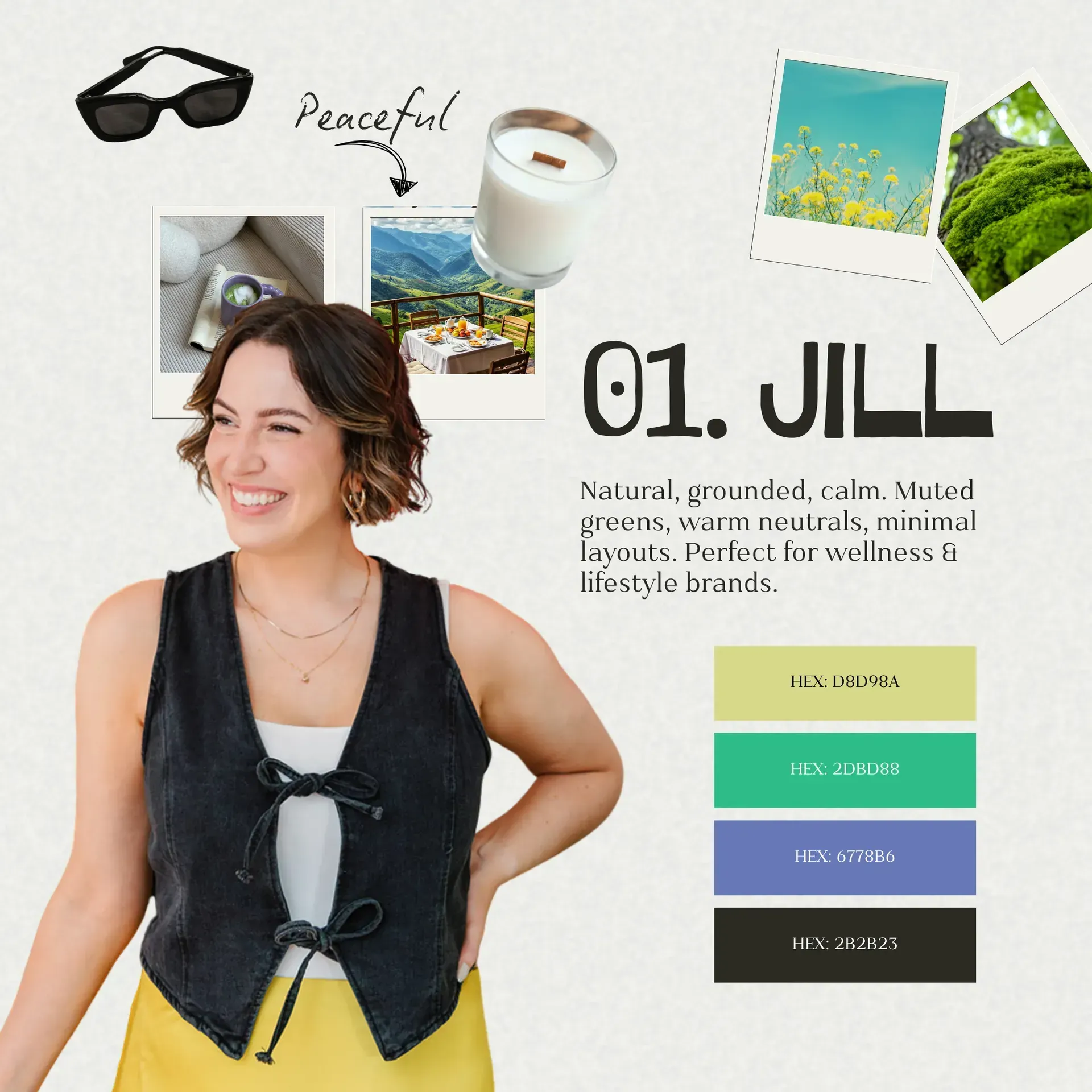
Jill as a Brand
Natural, grounded, calm
If Jill were a brand, her visual identity would feel soft, natural, and balanced.
Her colour palette leans into muted greens, warm neutrals, and earthy tones. Her design style feels thoughtful and steady. Nothing feels rushed. Just tranquil, and sleek.
From a branding perspective, Jill represents:
- Natural colour palettes in branding
- Calm typography and clean layouts
- Minimal design that feels trustworthy
- Brand identity built on clarity and ease
This kind of brand works well for wellness businesses, coaches, lifestyle brands, and service based businesses that want to feel approachable and grounded.
It is a great example of how branding can build trust without shouting for attention.
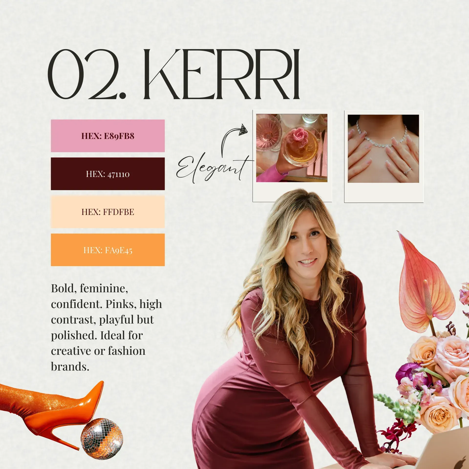
Kerri As A Brand
Girly, bold, confident
If Kerri were a brand, her identity would feel expressive, feminine, and confident.
Her colour palette includes pinks, rich tones, and high contrast accents. Her design choices feel intentional and playful while still polished.
From a design perspective, Kerri represents:
- Bold colour palettes in branding
- Feminine typography and strong visual hierarchy
- Brand identity that feels confident and memorable
- Visual storytelling through colour and layout
This type of branding works beautifully for creative businesses, beauty brands, fashion brands, and service providers who want their personality to be visible and memorable.
It shows how bold
branding can attract the right audience without losing professionalism.
What this means for your business brand
Here’s the part most businesses miss: there is no single correct branding style. Strong branding isn’t about following trends, it’s about creating alignment that truly reflects your business.
Your brand should reflect:
- Your personality
- Your values
- Your audience
- Your goals
- How you want people to feel when they interact with your business
When branding is aligned, your website feels cohesive, your marketing feels clearer, and your business feels more credible.
When
branding is not aligned, even the best marketing struggles to convert.
How Branding, Colour, and Typography Work Together
Brand design is not just about aesthetics, it’s strategic. Colour psychology shapes emotion and perception, typography builds trust and readability, and layout guides how people navigate your website. When these elements work together, your brand feels intentional rather than accidental, which is why professional branding and website design are so closely connected.
How to know if your brand identity needs a refresh
If you are wondering whether your brand is working as hard as it should, here are a few signs to look for:
- Your visuals feel inconsistent across platforms
- Your website does not reflect your personality or values
- Your colours and fonts feel random or outdated
- Your brand does not attract the clients you actually want
- Your business has evolved but your branding has not
If any of those feel familiar, it might be time for a brand refresh or a website update.
And no, that does not always mean starting from scratch.
Branding that feels like you
At Lume, we believe branding should feel human, clear, and aligned with who you actually are.
We are not here to throw glitter on something that does not work. We are here to help good businesses look as legit as they actually are.
If you are curious about what your brand could look like with more clarity and intention, we would love to explore it with you.
Published :
Craving more?
WE LOVE THAT.