Why Holiday Colour Palettes Matter for Small Business Branding
Filed under:
Holiday Colour Palettes That Actually Work (and Why)
Holiday visuals aren’t just about looking festive, they’re about creating a feeling. The right palette can spark nostalgia, warmth, or excitement. The wrong one? Off-brand, forgettable, or just… meh.
In this post, we’re breaking down four holiday colour palettes, why they work, and how you can adapt them for your
brand using colour psychology theory to connect with your audience and stand out.
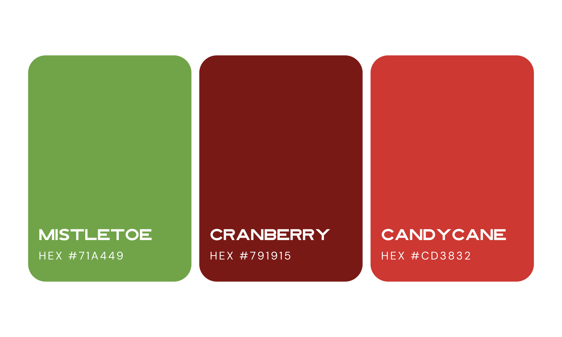
Classic Red & Green: Tradition That Still Works
- Why it works: Instantly recognizable, nostalgic, and festive without trying too hard.
- Colour psychology branding: Red = energy & excitement, Green = growth & calm. Together, they feel balanced, cheerful, and timeless, just like the Canadian department store Simons. They really leaned into red and green for its holiday collection which instantly created the festive, nostalgic feeling. These colours draw attention, spark holiday cheer, and subtly communicate warmth and trust, showing how top Canadian brands use colour psychology in seasonal campaigns to connect with their audience.
- How to use it: Add subtle pops of red and green in marketing graphics, email headers, or social posts without overpowering your brand colours.
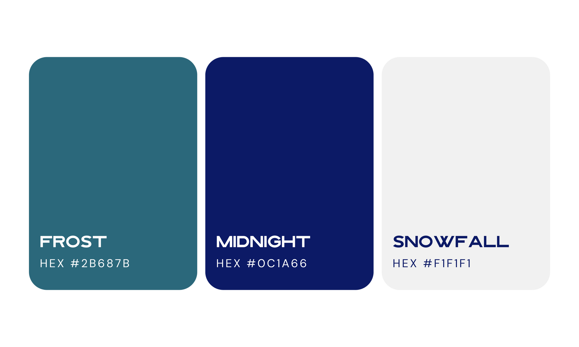
Winter Whites & Blues: Clean, Calm, & Elegant
- Why it works: Minimal, modern, and effortlessly cozy.
- Colour psychology today: White = clarity & simplicity, Blue = trust & calm. A perfect combo for service-based brands that want to feel approachable and professional.
- How to use it: Backgrounds, social graphics, or seasonal email campaigns with silver or icy accents.
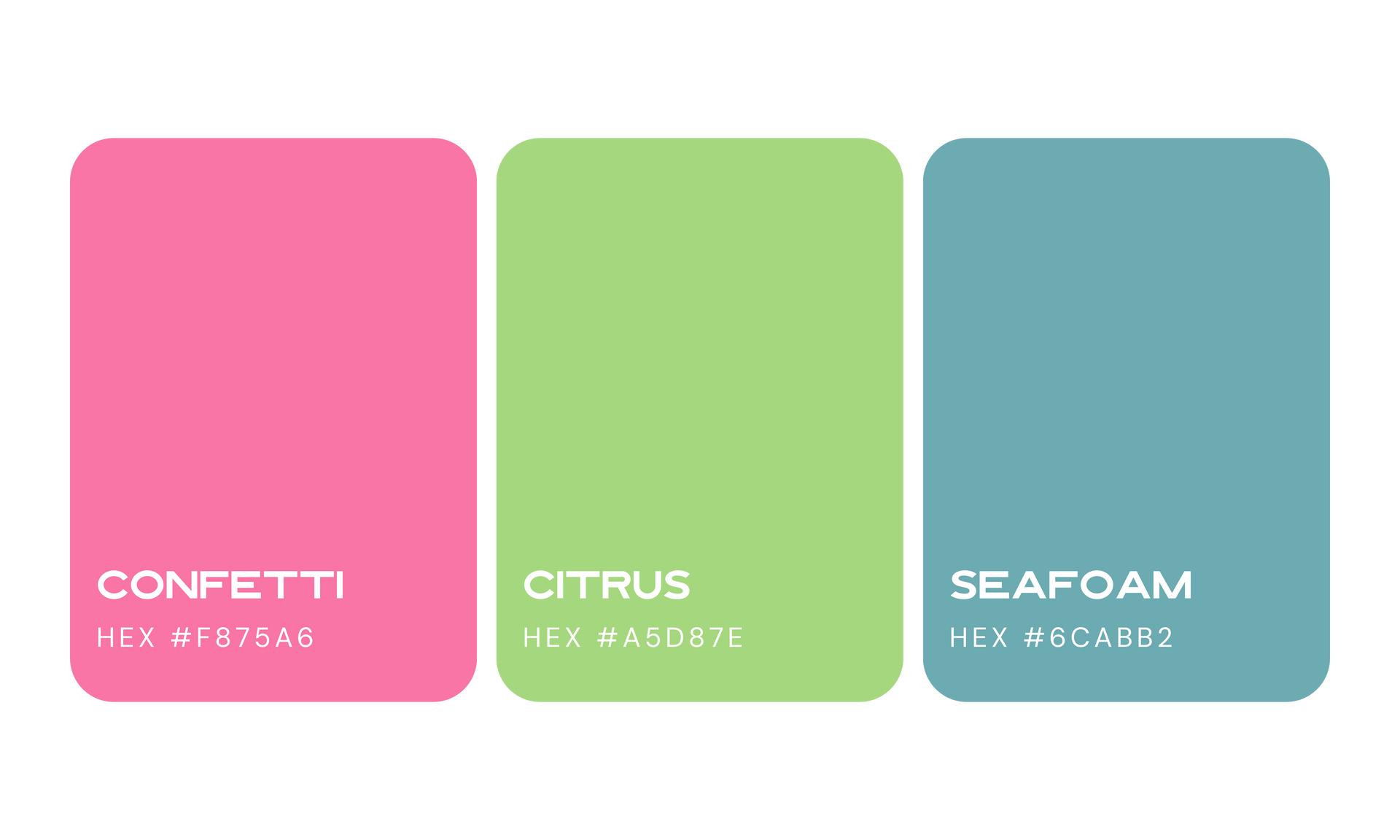
Unexpected Colours: Stand Out From the Crowd
- Why it works: Pink, teal, jewel tones, or other playful combinations feel fresh and modern.
- Colour psychology tricks: Bright or uncommon colours spark curiosity, creativity, and instant attention.
- How to use it: Try small bursts of unexpected colour in branded holiday graphics, gift guides, or social campaigns. Especially if your brand leans personality-driven.
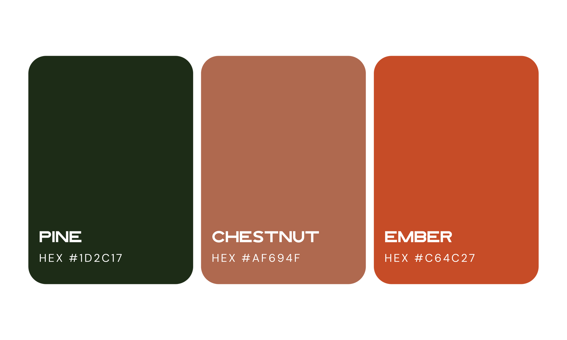
Earthy & Cozy Tones: Warmth That Feels Human
- Why it works: Browns, burnt oranges, deep greens create grounded, comforting, “welcome in” vibe...
- Can colour psychology improve user experience on e-commerce websites? Yes, these tones can make clients feel more at ease, great for brands wanting a warm, approachable aesthetic during a busy holiday season.
- How to use it: Holiday emails, client gifts, or
behind-the-scenes visuals that feel warm without screaming “holiday stock photo.”
Bringing It All Together
You can play with seasonal palettes without losing your brand consistency.
- Pro Tip: Choose one accent palette for the season, and keep your core brand colours leading the way..
- Reminder: Story-driven visuals + intentional colour choices = trust, recognition, and a brand that sticks..
Need help with
seasonal graphics, social templates, or custom illustrations? We’ve got you covered.
Visit our
Extras page to see how we can level up your
brand
visuals.
Published :
Craving more?
WE LOVE THAT.

