Lume Creative : Why We Refreshed Our Website
Filed under:
Creative design company for businesses in Ontario
They say your brand should grow as your business grows—and oh boy, did ours need a glow-up.
As we hit year four of Lume, we realized our old site just wasn’t doing us justice anymore. Our services had evolved, our portfolio had grown, and our brand voice had really found its stride. But our website? It still looked like day one.
So we hit refresh.
Hard.
In this blog, we’re giving you a behind-the-scenes look at why it was time for a change, how we approached our redesign, and what the new Lume site says about who we are now.
A Look back
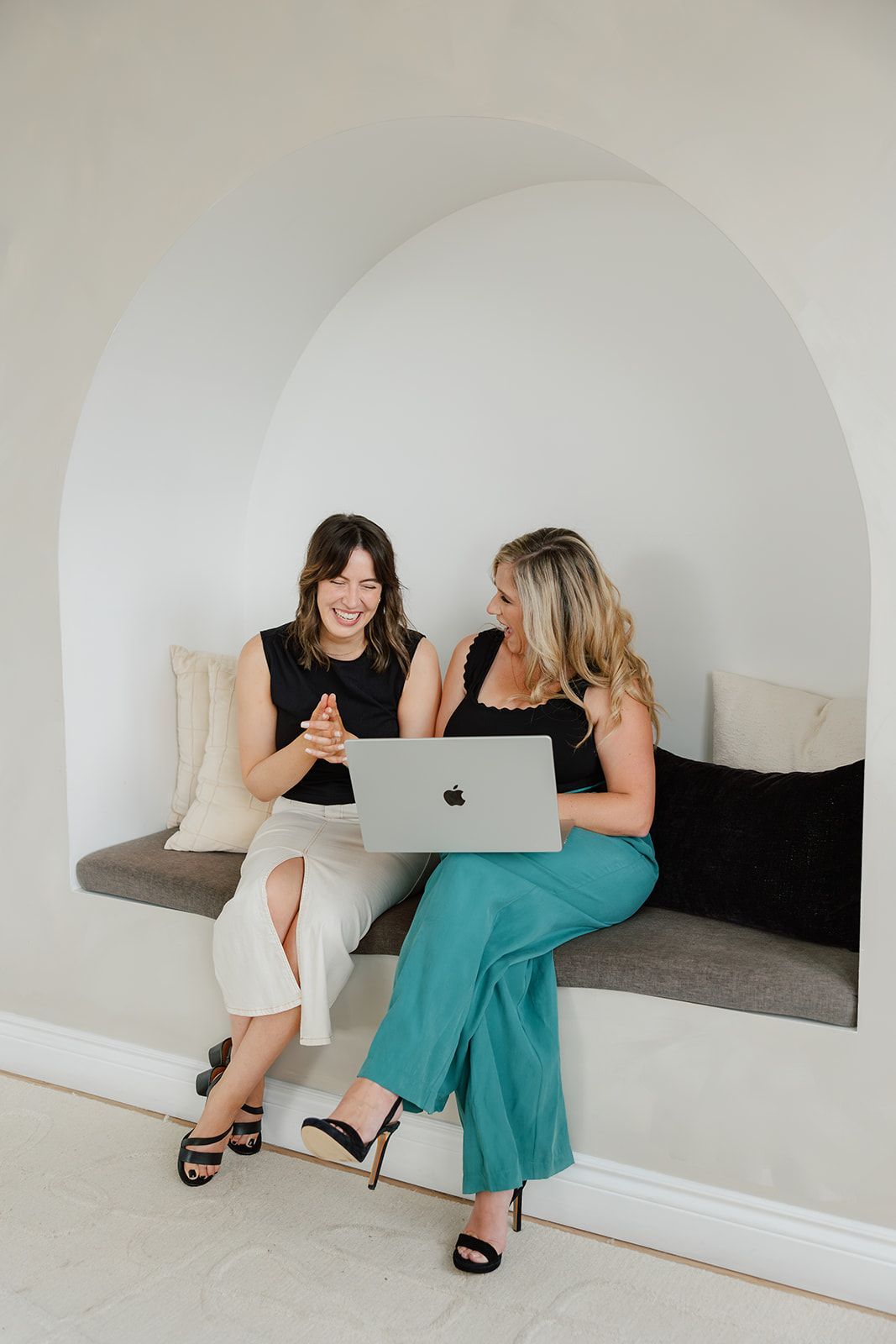
When we launched Lume, we were scrappy and full of ideas—and our original website reflected that. It got the job done, but let’s just say it didn’t exactly scream “thoughtful strategy meets polished design.”
We were busy building for others, so naturally, our own brand took a back seat. (Relatable, right?)
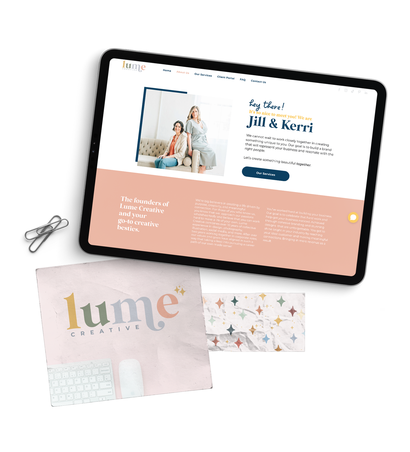
A LEAP FORWARD: What's new
Our new site was designed with intention—just like the work we do for our clients. It’s:
- Strategic: Clear user flow, elevated copy, SEO-ready
- Personality-packed: Our tone and design finally match our vibe
- Tailored: Built to showcase what we
actually offer now and what we do really well.
We also made space to show off our work (finally), share resources, and make it easier for future clients to get to know us. See what we've been working on lately →
Our Portfolio
Ready for Your Own Refresh?
We’re offering $250 off website services booked before June 30, 2025 for subscribers only.
If you’ve been sitting on a redesign, this might be your sign.
Published :
Craving more?
WE LOVE THAT.