Why Typography Matters in Branding
Filed under:
What is Typography in Branding
The way your text looks shapes how people feel about your
brand. Is it professional or playful? Polished or rushed? Trustworthy or forgettable? Typography is more than a style choice, it’s how your
brand communicates without saying a word.
What Typography Really Means
Let’s break it down:
- Typeface: the design family, like Helvetica or Garamond
- Font: a specific style within that family, like Helvetica Bold or Garamond Italic
- Typography: how you arrange type, including your mix of fonts, sizes, spacing, and styles
It’s not just about picking a pretty font. Typography is how all of these elements come together to create a visual voice for your brand.
Why Hierarchy Matters
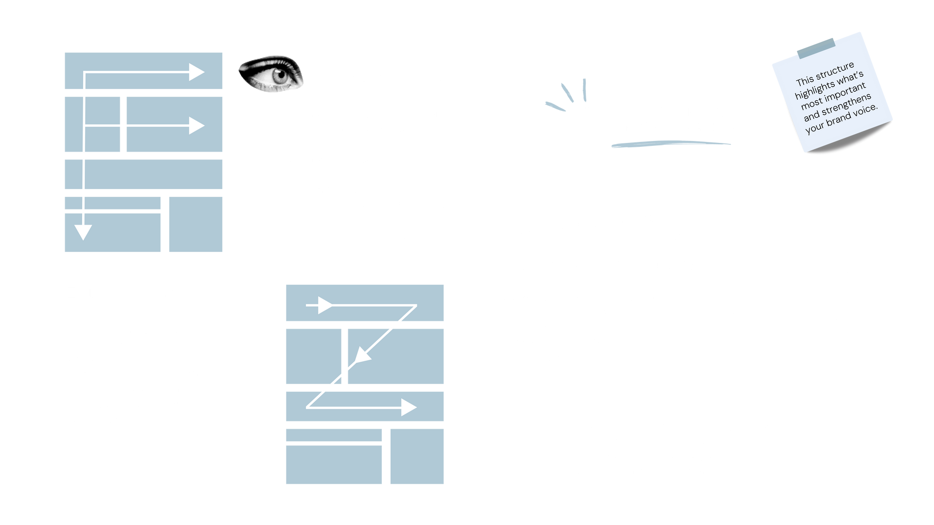
Most readers online don’t read every word. They skim in “F” or “Z” patterns. Strong typography creates a clear hierarchy that guides the reader’s eye, makes content effortless to scan, and helps the brain process and retain information faster.
A simple way to structure hierarchy is with three levels of typography:
- Headline: grabs attention and communicates the main idea
- Subhead: adds context and helps break up content
- Body text: delivers details and supporting information
This structure clarifies what’s most important and what’s secondary, helping your audience engage with your content without feeling overwhelmed.
How Typography Shapes Your Brand Voice
When typography is thoughtfully applied, it becomes the foundation of your brand’s voice. Font choices combined with hierarchy help communicate personality, professionalism, and trustworthiness.
For example:
- A bold sans serif headline can feel confident and modern
- A script subhead can add warmth or personality
- Well-spaced body text can make content approachable and easy to read
Even small choices, like adjusting spacing or using subtle differences in weight, can make your messaging feel intentional and polished.
Quick Tips for Using Typography
- Limit the number of typefaces to keep your design cohesive
- Use hierarchy to guide your reader and emphasize key points
- Pair font styles thoughtfully to create contrast without clutter
- Remember that legibility always comes first
Typography is a subtle but powerful way to make your brand feel professional, approachable, and consistent across all touch points. Thoughtful type choices can guide your audience, clarify your messaging, and give every piece of communication a polished, intentional feel.
Want to see how thoughtful typography can elevate your own
brand? Our
Custom Branding and
Semi-Custom Brand Kits are designed to help service-based businesses show up consistently, confidently, and beautifully. Take a closer look and explore the possibilities for your
brand.
Published :
Craving more?
WE LOVE THAT.